Portfolio
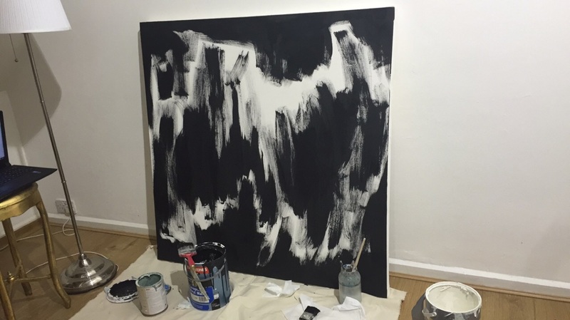
New images I am working on for the upcoming exhibition in London during June. Here I am exploring the difference and variety of mark and fluidness of the line work. I still work with an abstract approach as I think it reflects my style and emotion that is put into the work.
|
|
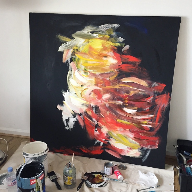
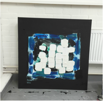
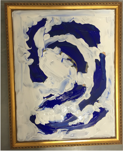
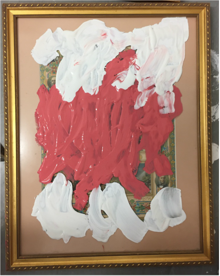
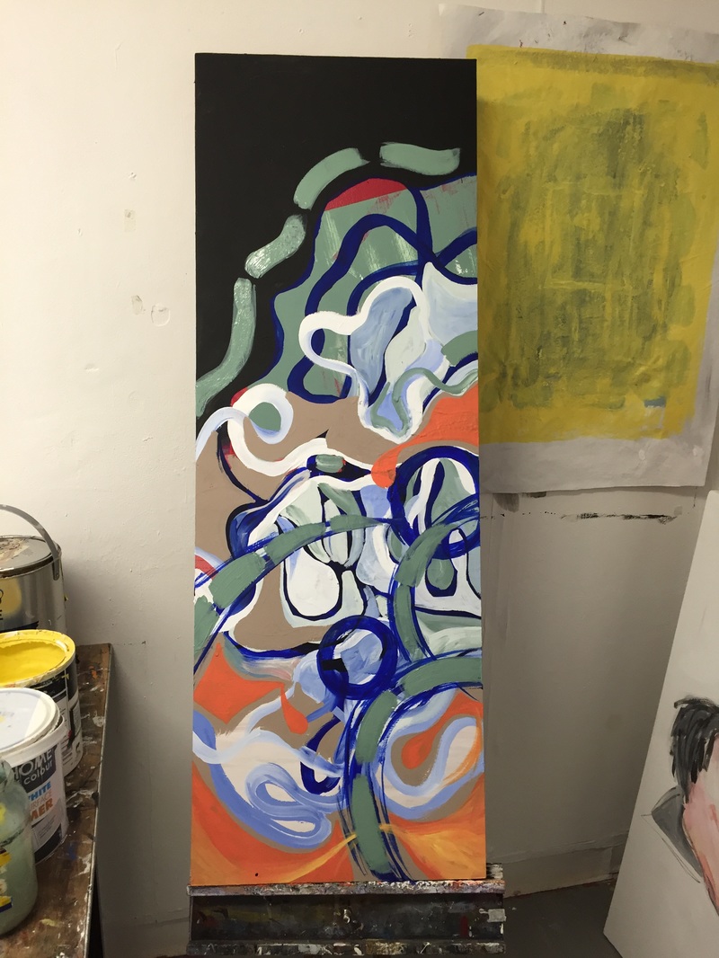
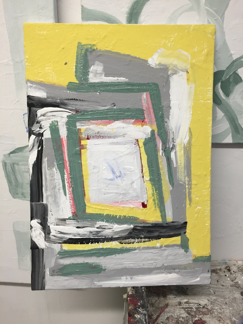
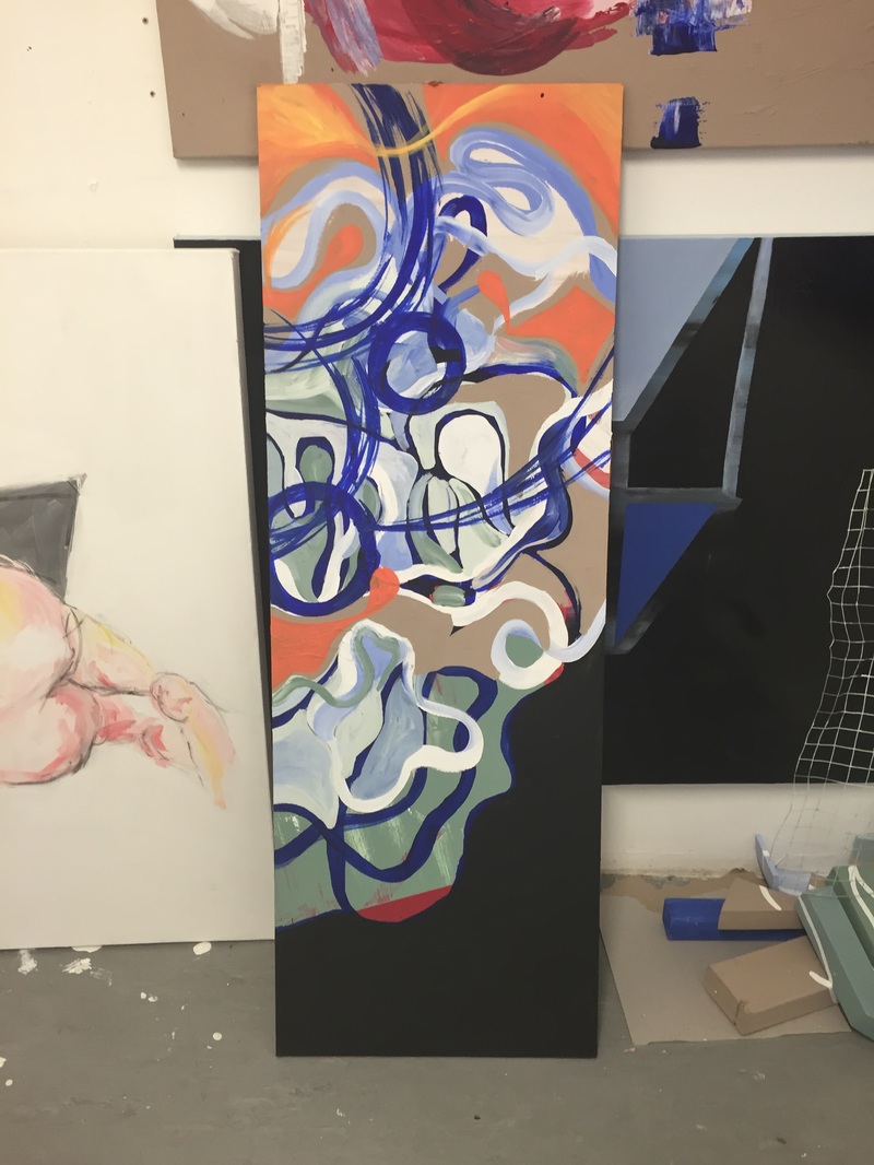
These works are my portfolio of new pieces, they explore the idea of gestural freedom in relation to abstract expressionism.
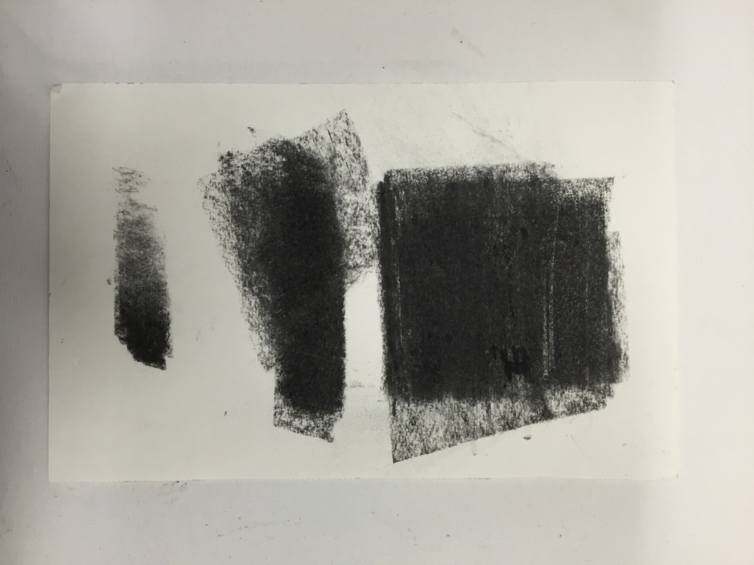
Experimenting with colour, form and shape, looking at the way the touch of the brush can effect the reading of the piece. The way the movement and lightness of the art reads differently to my previous work of distortion and the body. It reflects the way in which artists use their brush, how it is personal to them, the subjectivity and elusiveness of the artwork becomes apparent with the gestures made. With geometric abstraction at the grounds of my work I developed my practice into the minimalist ideas of the touch. Taking my work back to the basic principles of painting.
Experimenting with colour, form and shape, looking at the way the touch of the brush can effect the reading of the piece. The way the movement and lightness of the art reads differently to my previous work of distortion and the body. It reflects the way in which artists use their brush, how it is personal to them, the subjectivity and elusiveness of the artwork becomes apparent with the gestures made. With geometric abstraction at the grounds of my work I developed my practice into the minimalist ideas of the touch. Taking my work back to the basic principles of painting.
|
|
|
|
|
|
|
|
|
|
|
|
|
|
|
|
|
|
|
|
|
|
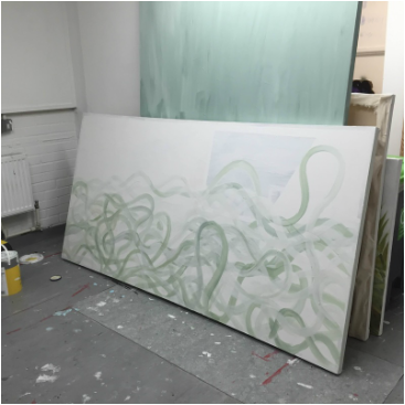
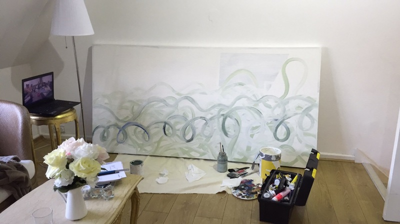
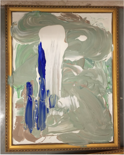
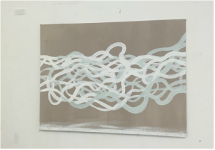
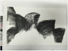
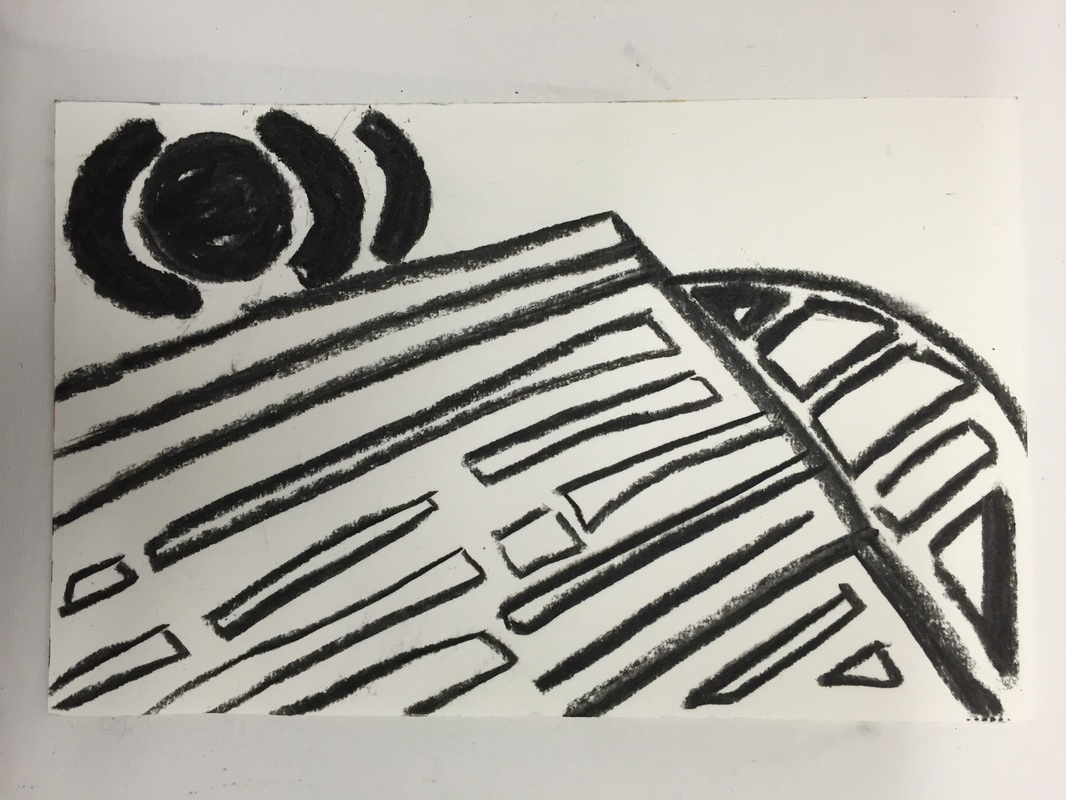
This image is my representation which actually was derived from the Sydney Opera house, the curve of building is reflected from the wash of colour and movement and action and motion of paint. The texture is layered, the pentimento of the piece is there to add emphasis on the looseness and freedom of materiality and force. The way a brush is moved across a board or canvas, is parallel to the emotion behind the image, the narrative and what is evoked from the piece to the audience. This piece was an experimental piece I have made, to which I am happy with but it doesn't reflect the form of shape and geometric abstraction completely. With work like this I have enjoyed making as you are free to create anything you want. Satre said, ''my freedom consists of what I am not''. I as an artist need to learn what you don't want to be when creating work and understand what I am.
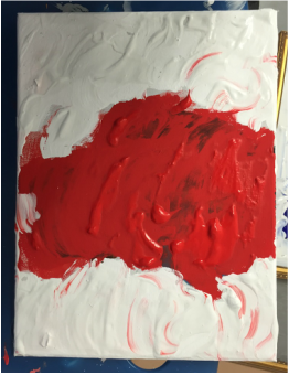
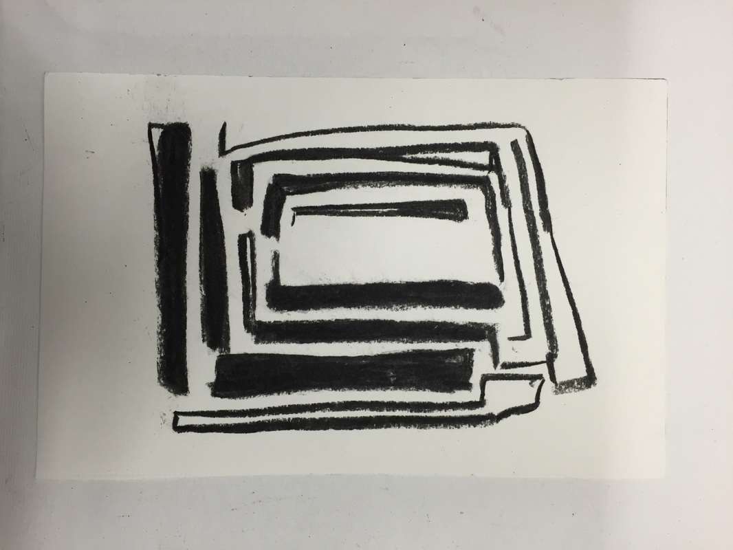
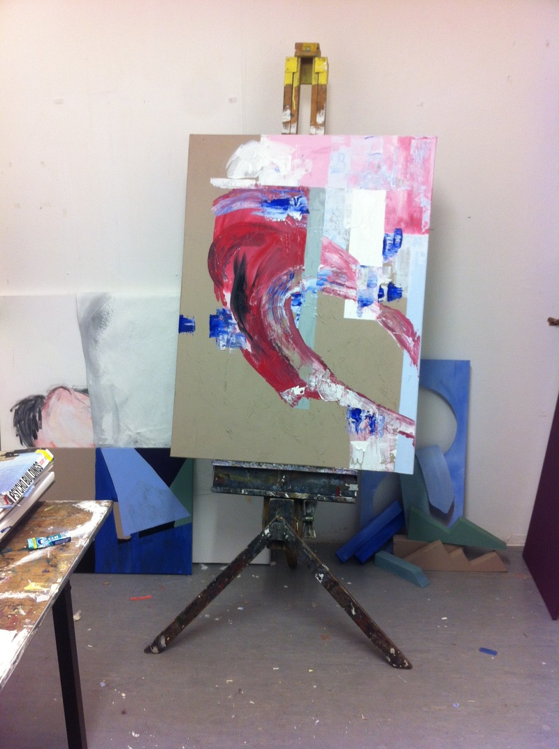
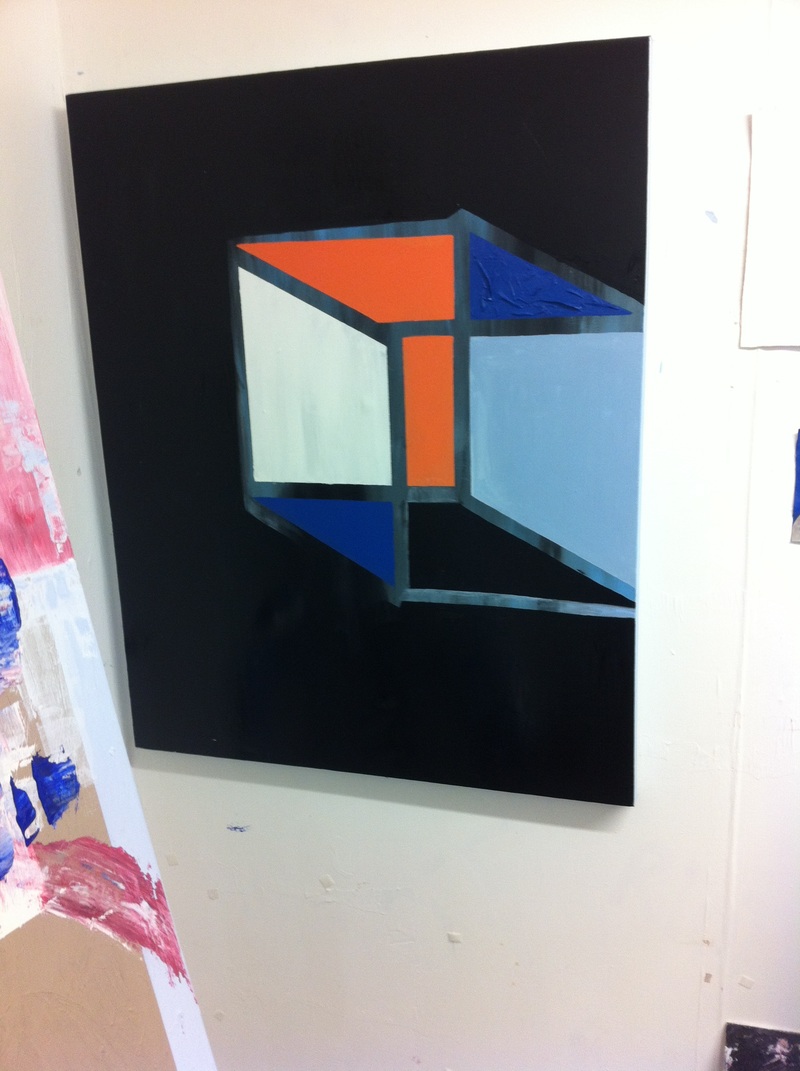
Crit Piece Below I had real trouble with making this piece, I struggled with the arrangement and idea of layering in the correct way, I don't like this piece as a whole resolved image as it lacks quality to me. The size, like normal I like to work with but the detail of the image does not flow consistently with the background layers of orange cubes, I think the colours are too harsh to sit together and angles of shapes do not interlock enough. However with all these notes to build from it gives me a chance to continue to make experiment pieces and continue to develop my practise. |
|
|
Crit show final piece.
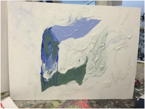
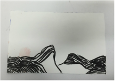
This piece is actually of the V&A museum, the way I constructed it is in layers built up consistent of shape and outlines that stood out to me, the interior that crafted shadows and alternate structures. |
|
|
|
|
|
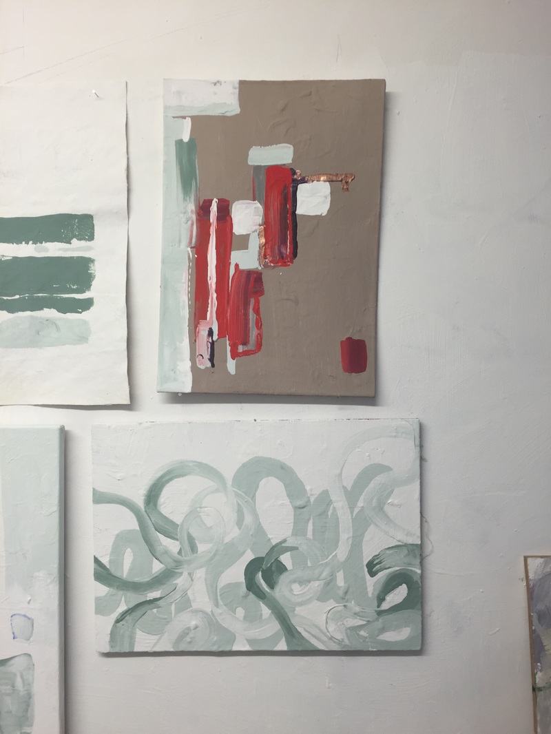
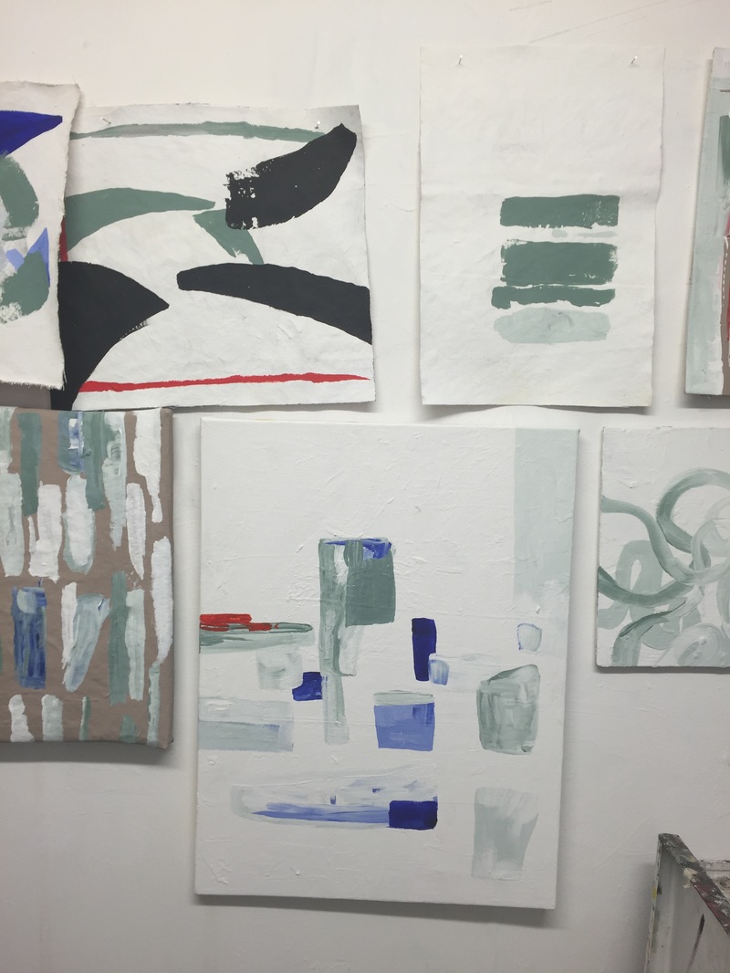
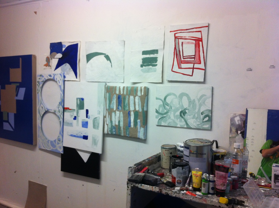
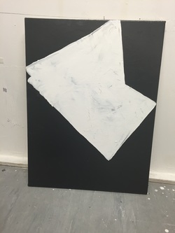
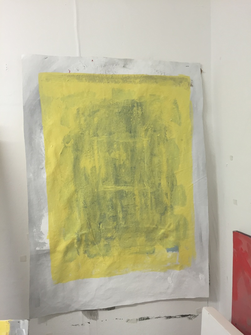
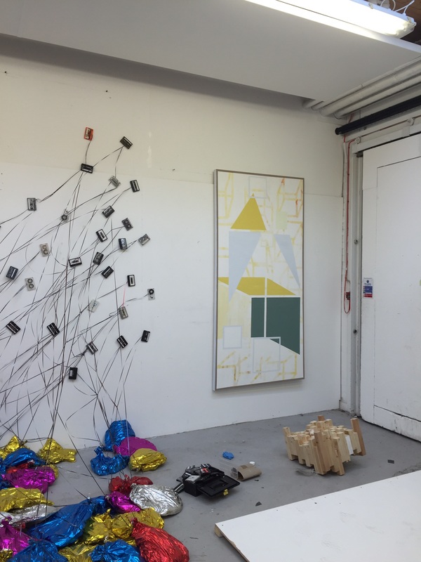
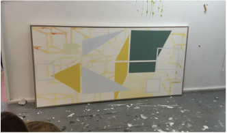
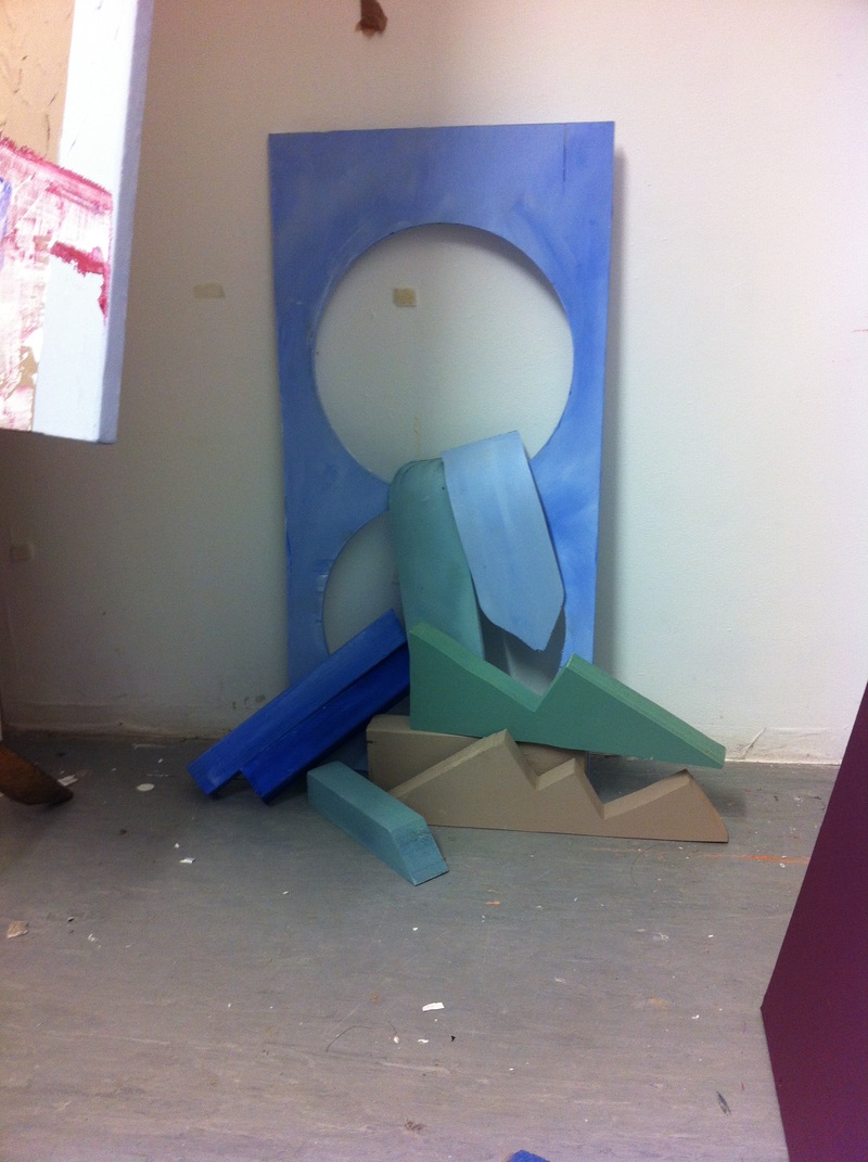
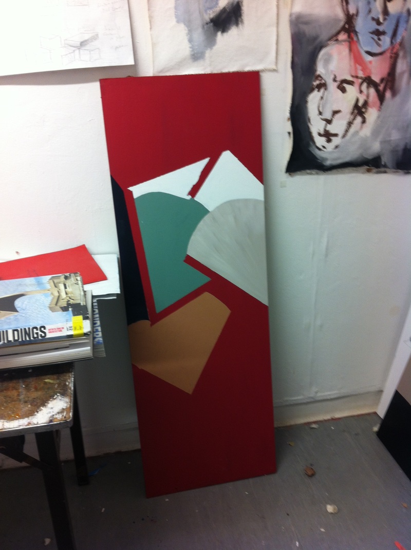
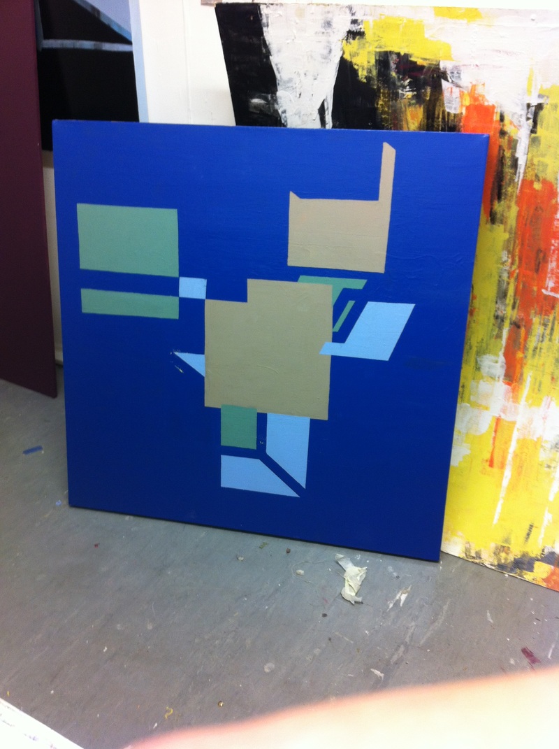
Studio pieces, test pieces working with the concept of exteriors in relation to geometric abstraction.
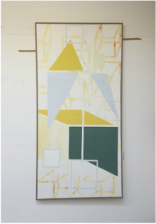
Exhibition piece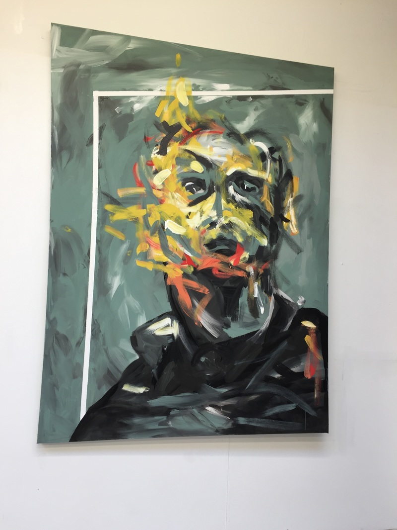
|
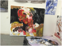
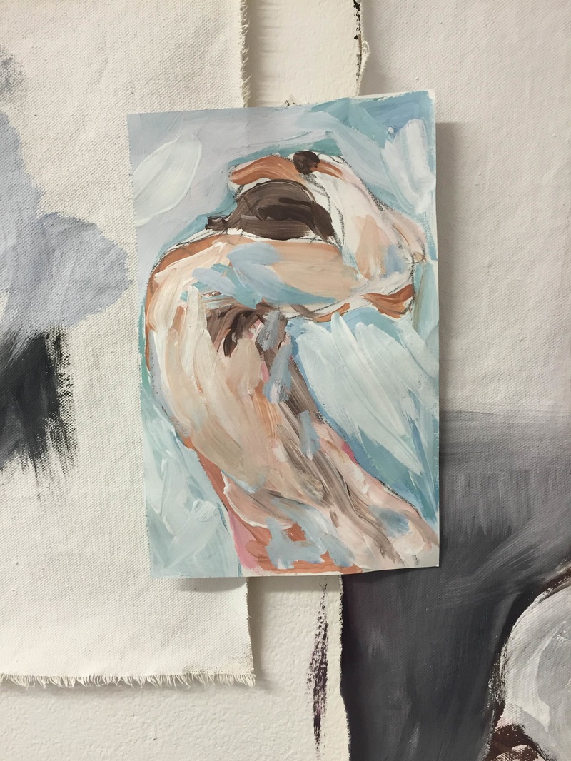
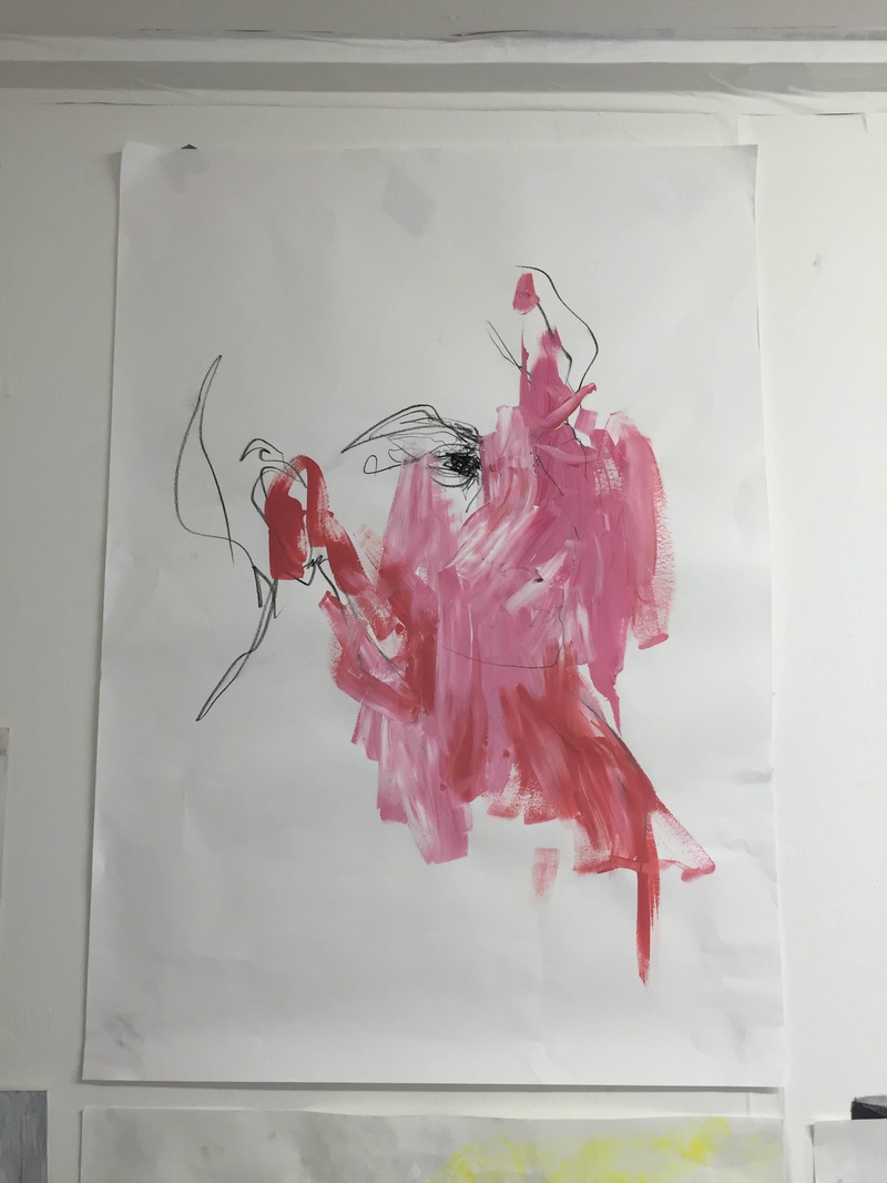
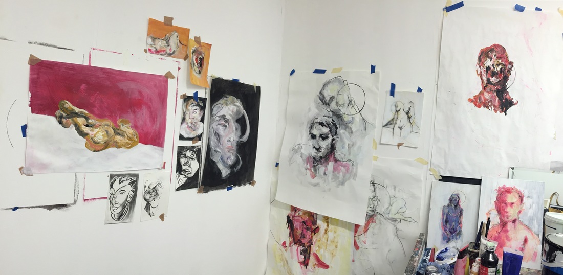
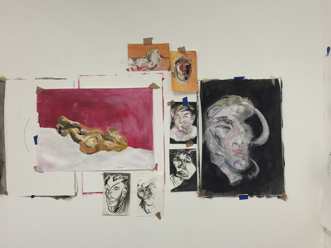
Crits - PaulMy piece is derived from the study of distortion in art. The disjointed, unconnected features that relate back to Francis Bacon's work. I looked through figurative art with more contemporary artists then took that inspiration and created a piece that showed the value of brush marks and mark making through expressive painting and colour. The topic of subject matter came up in the crits and I agree with what Paul said, subject matter is the point of the piece and in this image there is a lack of. From here I will look deeper into the meaning of portrait, the significance of the face. Something that has always interested me has been self portraits, why artists do them, how they perceive themselves and how it is projected onto others. I would like to make a series on this, on myself as the subject. Who better to dissect then the artist themselves.
Paul The idea of painting someone with meaning, power, known. Needs tension, substance, something to stare closer at. Links to Cecily Brown, Marcas Harvey. Take the news, take a figure in the public eye. Jonathon Yeo. Johnathon Miller, John Berger on portraits. |
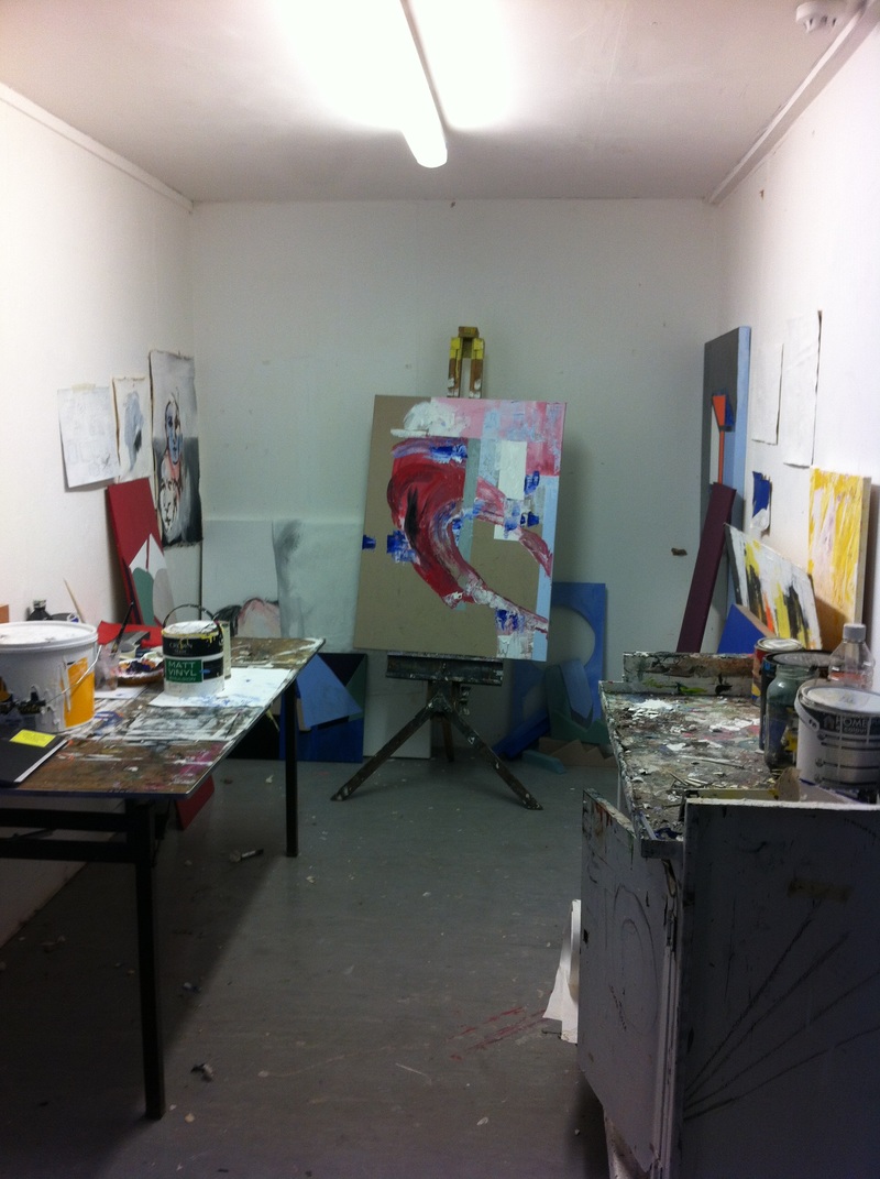
Below are some new pieces I have done, being more free with the colour and fluidity of brush stroke. Figurative art has such a glow about it, it is so intriguing, you want to look further. Above, full view of my studio, moving a few things around.
|
|
|
|
|
|
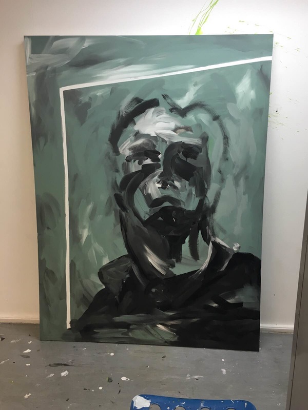
Final piece, first layer of the work.
200cm/150cm I had originally wanted to place him on a cube so it comes out on the canvas onto another dimension. The white line I left around him breaks up the colours and add a highlight naturally to it. From here I will be building up the layers adding brighter colours on top, golds and yellows to contrast and add more to the figurative abstract style that my work has. I have distorted his face and neck, elongating him almost like a Modigliani piece. I want there to be a texture that you can see clearly, the want to touch it and find out the feel is something I am attracted to in art. |
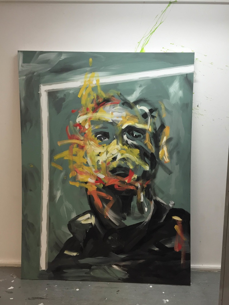
Day 2 of the piece, adding colour to brighten and contrast the image. It definitely lifts it, with such muted colours it need an edge to it. The issue with figurative art is knowing when is enough, what over does it and takes away the meaning and emotion from it. Often I can see work where either myself or another artists just adds too much to it, over powering the work. However it can always be read as not finished. I have one more layer to add to this and to neaten up the edges and details.
|
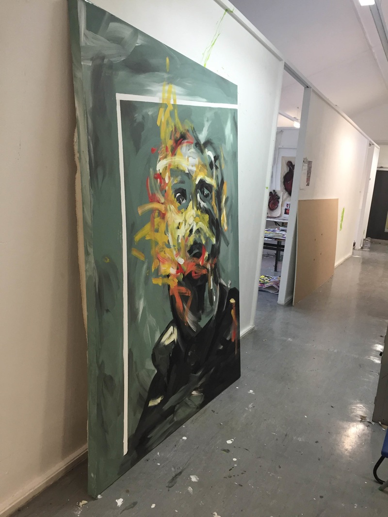
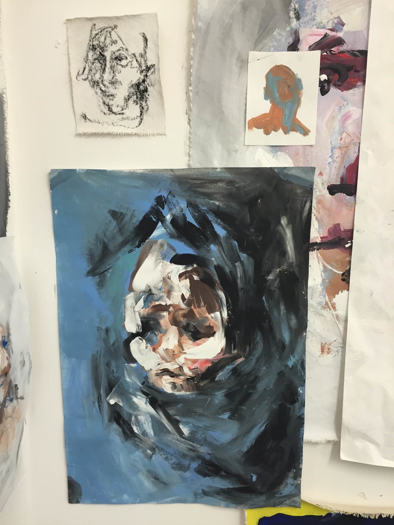
The side view I really like, it changes the way you read and absorb that image, you realise the height is greater and his face has a different emotion and narrative to it. His face is sad, looks so sad. I like the way it changes the image and how the audience reads it. That's what beautiful about art, when you look at it from a different alternative angle you see it in a new light.
|
|
|
|
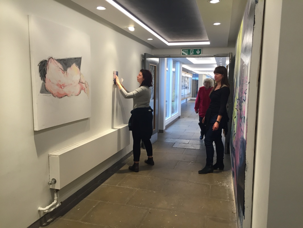
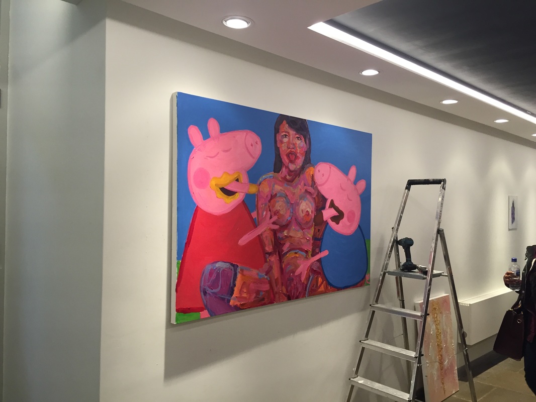
Taking part in the linear gallery today, it was a joint display from the painters out of 2nd & 3rd year. As a collective, the majority aimed to show the body and figure in a figurative style. Working with layers, texture, colour and form. The range of work was all very different to each other yet linked with themes to one another. It also gave me a change to hang work properly and learn the layouts for displaying work in the future as well. It's always interesting to see how people respond to your work, and others, for example, the peppa pig image had very strong responses with passers by questioning the meaning and all had the initial shock factor, so it's great to see the audiences reaction to certain pieces of artwork.
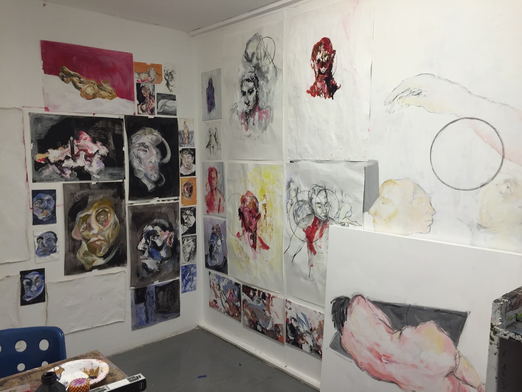
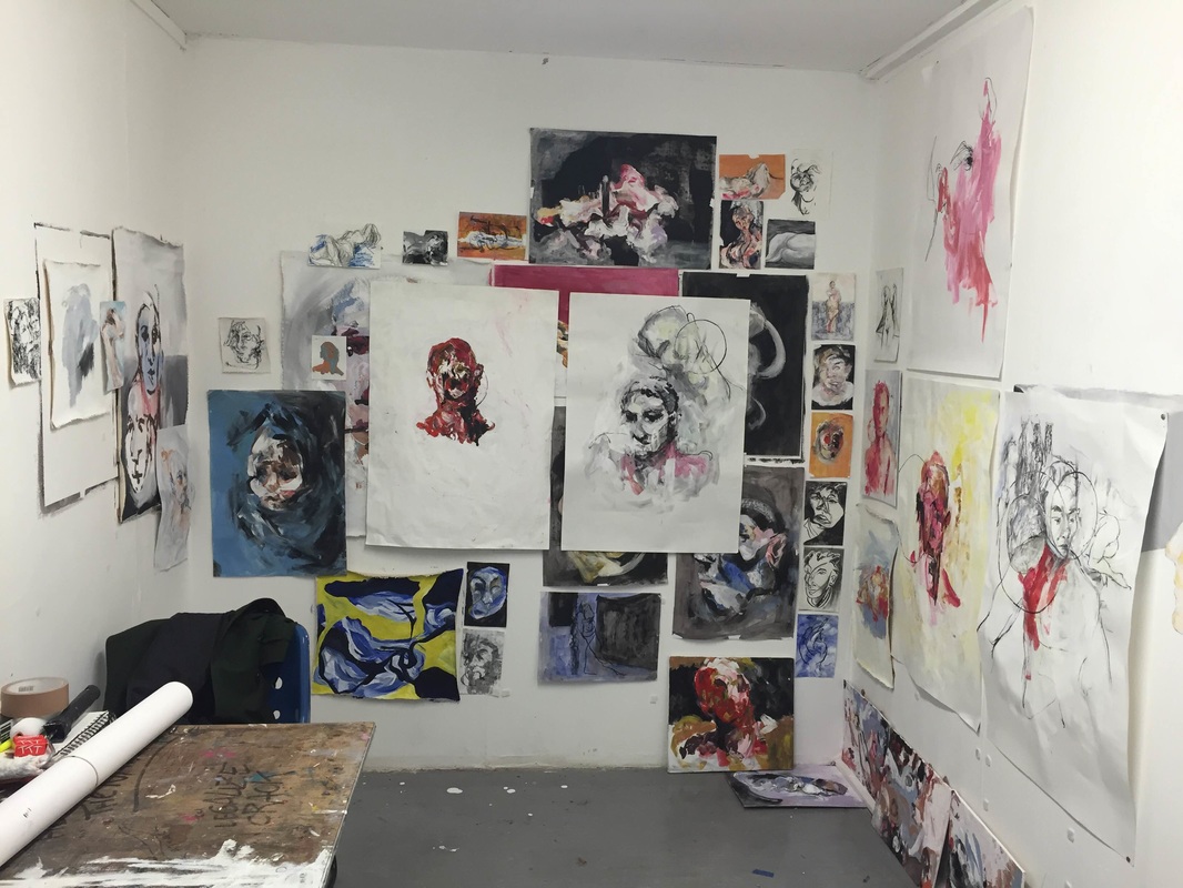
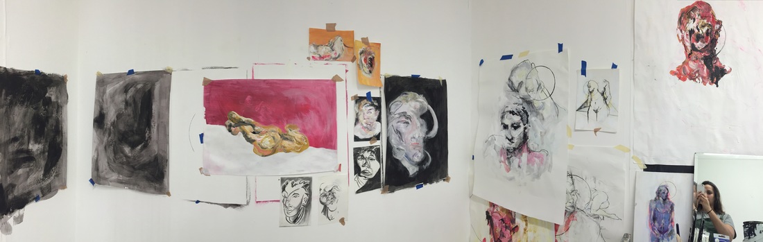
Reorganising my work and neatening everything up, using velcro and double sided tape, so its all alined. I have been priming canvas material in a range of sizes for further additions to my body of work. I've been working in a range of mediums and colour to see what works best. With artist influences and my own style of working. I feel I need to use less colour, a work more with sketches and charcoal as looking at the wall of colour becomes overwhelming, so it would balance out the viewing experience. From here I will be designing my final piece.
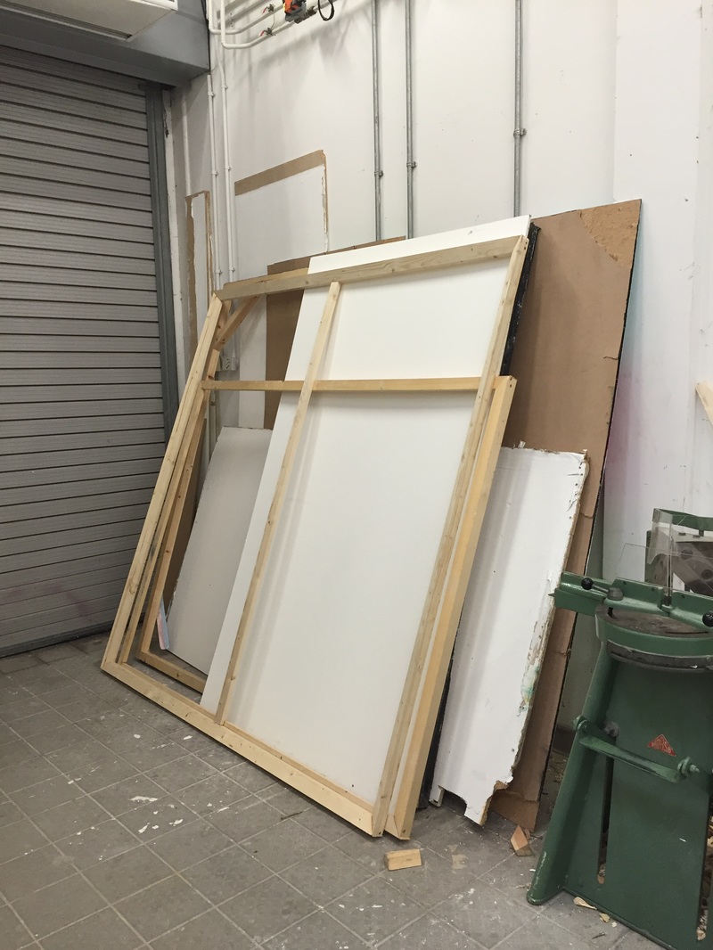
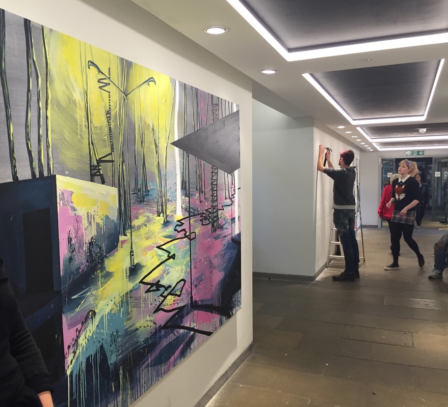
Building more canvases on a much larger scale than last time, I find working on a bigger scale is more suited to my style of work, as there is a sketch like quality to it that when downsized, doesn't look quite complete.
|
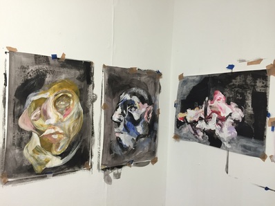
Further painting works.
Experimental work leading on from painting, 'the beauty in the grotesque.' As humans we are are prone to the unknown, abnormal and strange. Inspired by Francis Bacon and the obscene, I created 3D clay faces that twist and gnarl in each direction.
|
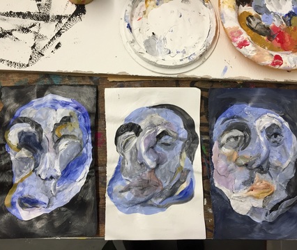
Francis Bacon inspired. Looking into the idea of distortion and chaos in art. The violence and emotion behind it and the way it conveys to the viewer.
|
|
The movement in the artwork is capture like a still from a film. There is so much theater in each piece. Experimenting with slo-mo videos and pausing to create the obscurity in the faces.
|
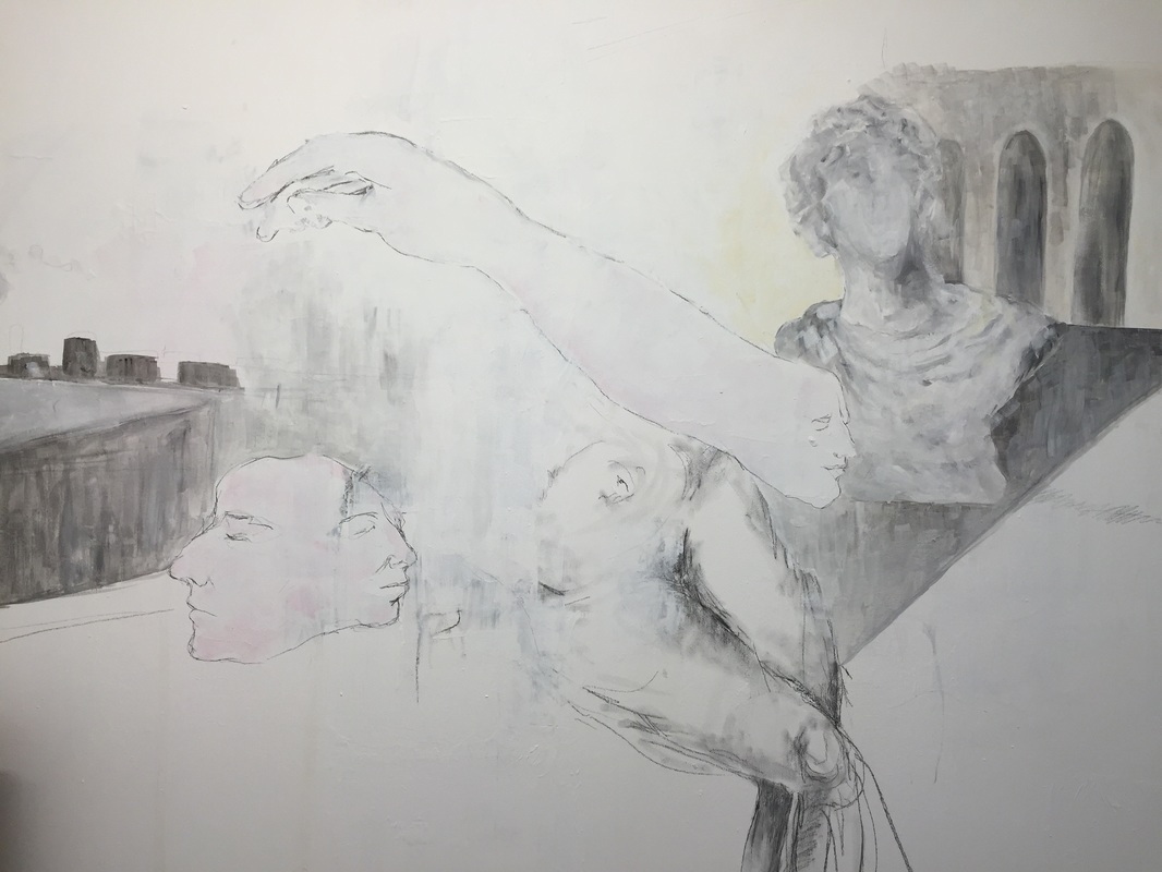
Exhibition piece, in response to the surrealist works of De Chirico
210cm/90cm
Handmaking the canvas
|
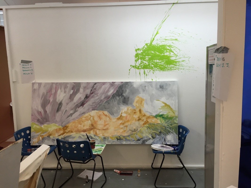
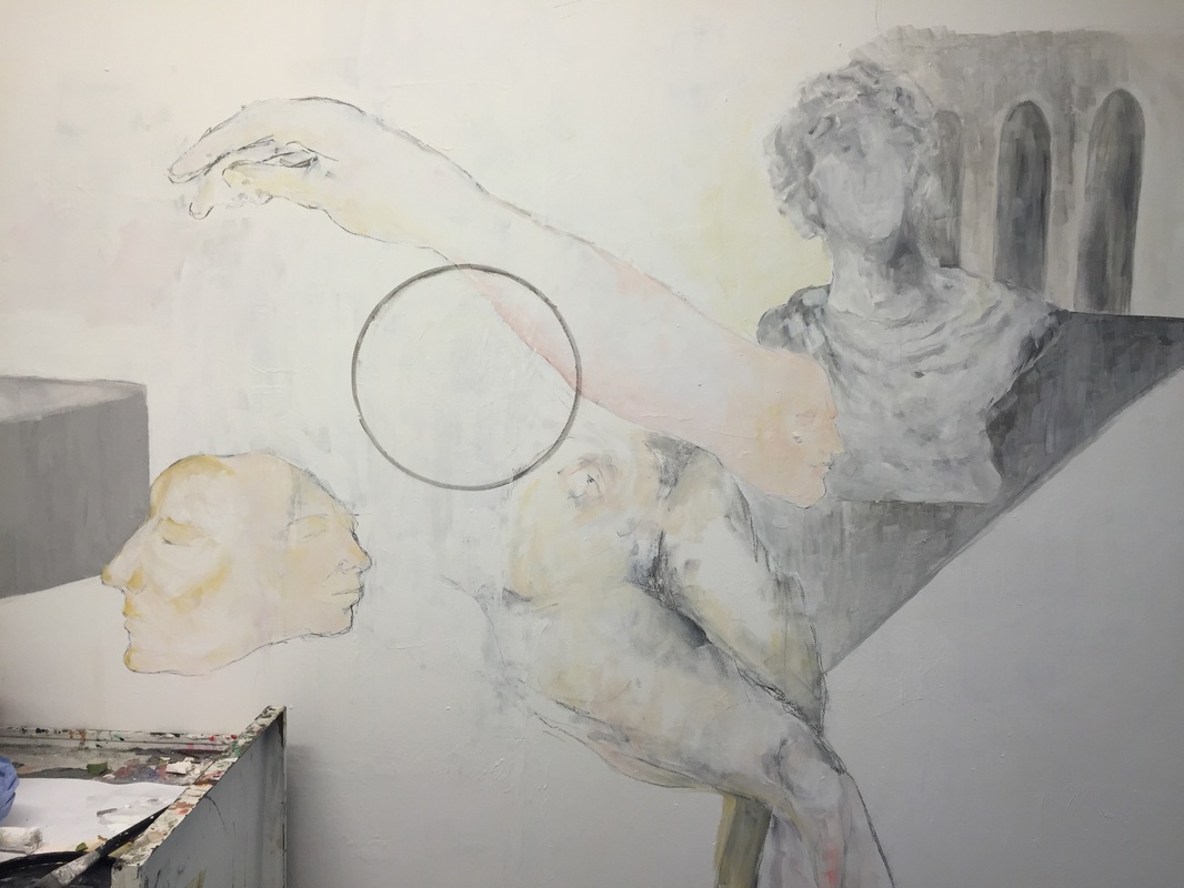
First designing for exhibition piece. With the idea of the 'stain' becoming an anomaly with in the image; I looked into symbolism. Circles being placed to distort and confuse the viewer.
|
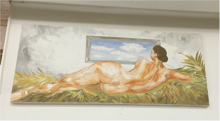
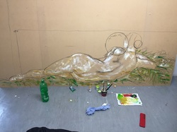
Progression image, I was inspired by 'Le rockby' by Venus. Basing the figure on myself I was able to add my own twist on a classic image.
|
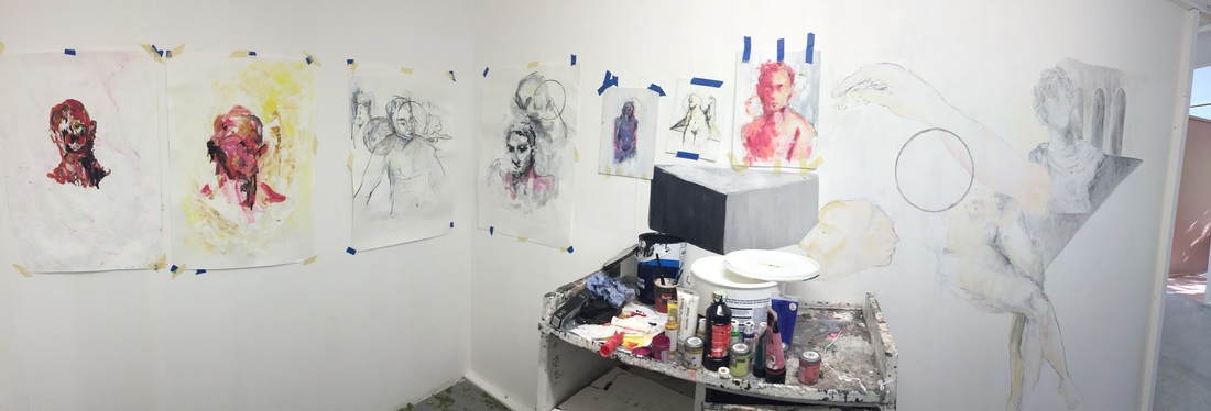
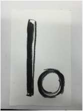
Studio images, playing around with circles. Using symbolism in its most basic form.
|
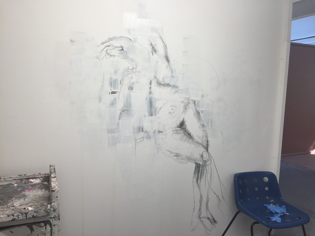
In response to the work of De Chirico, creating surrealist images and altering the realism and juxtapositions of objects and figures.
|
|
